Concept rebrand
The Net Set
A tennis and stringing shop in Sugar House with a dated look. This is a concept rebrand: mark, palette, type, voice, social templates and a homepage.
The rules
A small shop needs a system someone else can keep using. Six rules cover almost every piece.
-

Mark
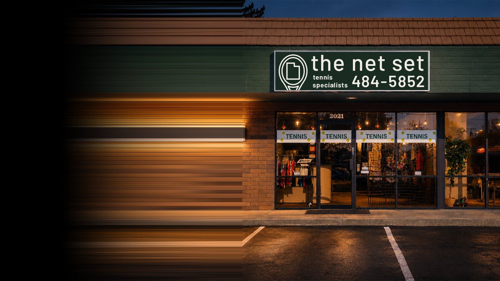
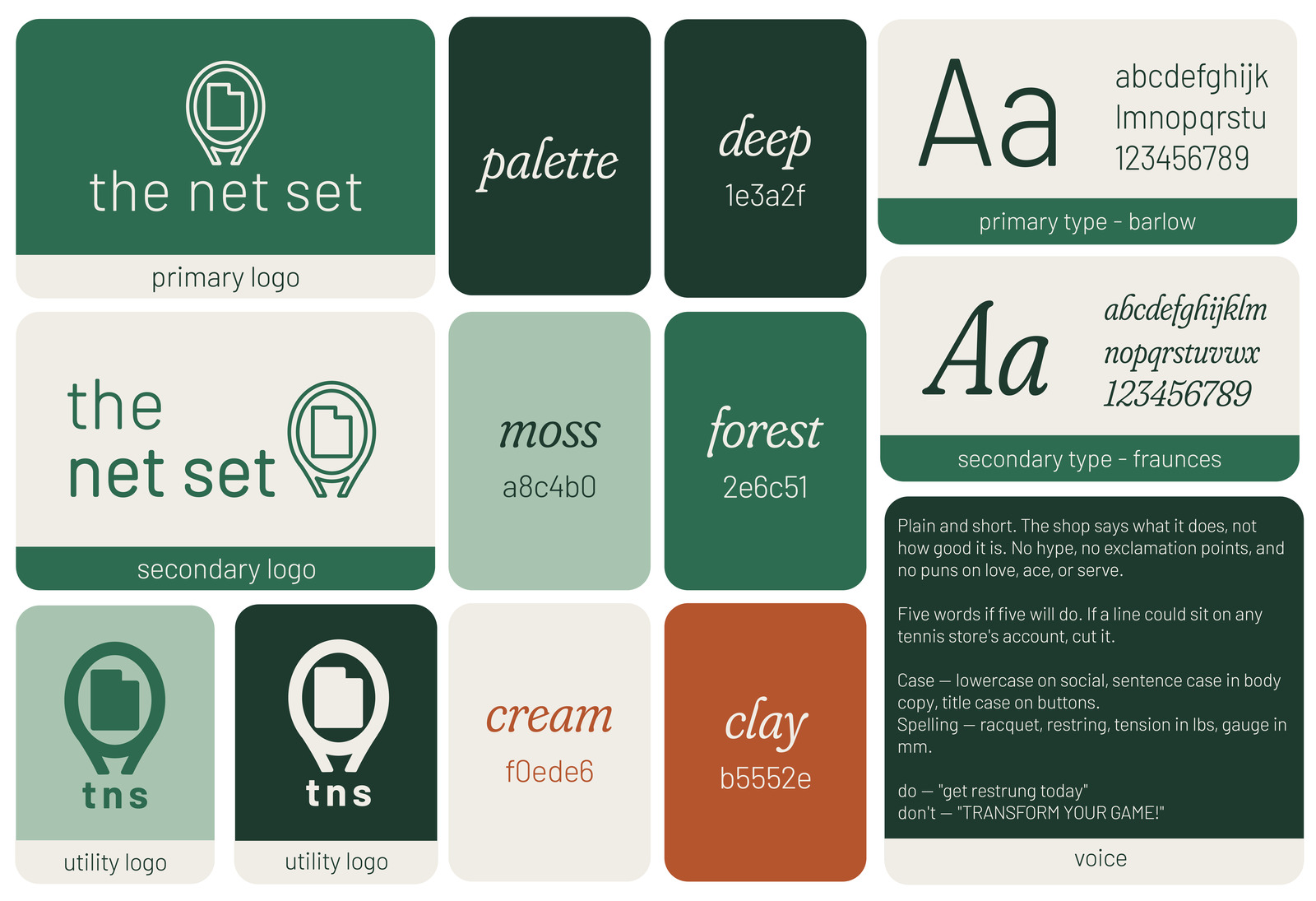
The mark is a racquet head with Utah where the strings would be. It says tennis and it says local in one shape. When there isn't room for the full name, tns goes under the mark instead.
-
Colour
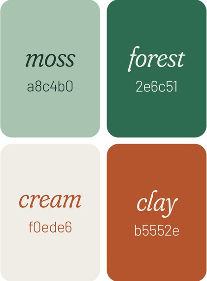
Three greens do most of the work: deep for text and dark grounds, forest for the name and buttons, moss for quieter fills. Cream is the background instead of white. Clay is the one warm colour, and it stays rare.
-
Type
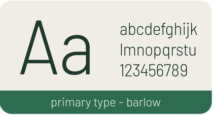
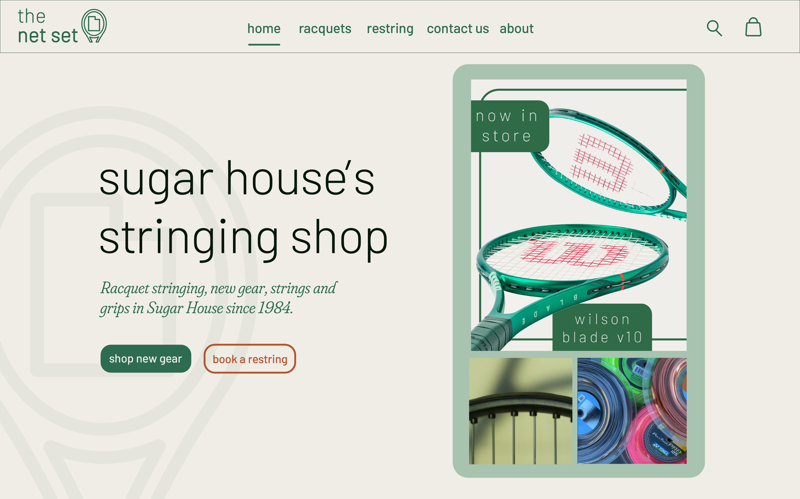
Barlow for almost everything, light and lowercase, spaced out wide on social. Fraunces italic comes in for one line at a time, like the line under the homepage headline, and never for a whole block.
-
Voice
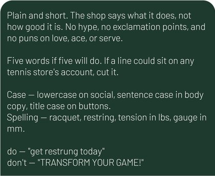
Plain and short. The shop says what it does, not how good it is. No hype, no exclamation points, no puns on love, ace or serve. “Get restrung today,” not “Transform your game!”
-

Tags
On social, each message sits in its own green block and the name runs down the right edge, one letter at a time. The photo changes from post to post. The frame doesn't.
-

Clay
On the site, clay only shows up on the restring button. Buying gear is the green button. Booking a restring is the thing the shop is actually known for, so it gets the one colour nothing else uses.


The set
Same rules on the sheet, the feed and the site.
-

Social — new gear -
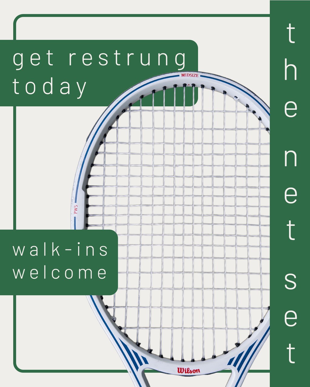
Social — restringing
On the street
The sign is where most people meet the shop, so the mark had to hold up lit at night from the parking lot.