Sports branding
saci
My fantasy basketball team, branded like a real pro team. It started as For Astrud, a tribute to Astrud Gilberto the year she died, and it's still in her honor: saci is one of her songs, and the Brazilian folk trickster in a red cap.
The rules
Everything comes from vintage bossa nova record sleeves: grainy black and white photos, cream paper, one hit of red.
-
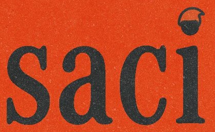
The red cap
The cap is the whole symbol. I use it on its own instead of drawing the character: on the i in the wordmark, over a player's head, next to the score. The wordmark has a version for each size it runs at.
-

Palette
Cream, charcoal, red, tan and a blue accent. Tan took three tries: green looked like Christmas, olive brown sat at the same value as the red, tan worked. Cream is the paper and tan fills the secondary panels.
-
Type
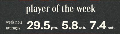
A serif for names, labels and the wordmark. A wide sans for headlines and stats.
-

Opponent logos
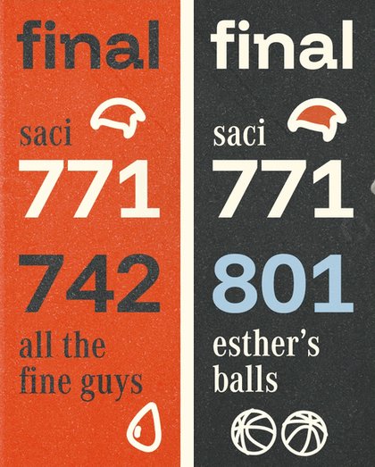
The other teams in the league don't have logos, so they get doodles: a shopping cart, an arowana, a UFO, a drip, a pair of basketballs.
-
Wins and losses
Red means saci, and saci winning. A win gets a red score panel. A loss gets charcoal, and the opponent's winning score turns blue.
-

Grain and Ws
Everything gets grain, like a printed sleeve. On a win, a wall of Ws runs behind the graphic.


The schedule
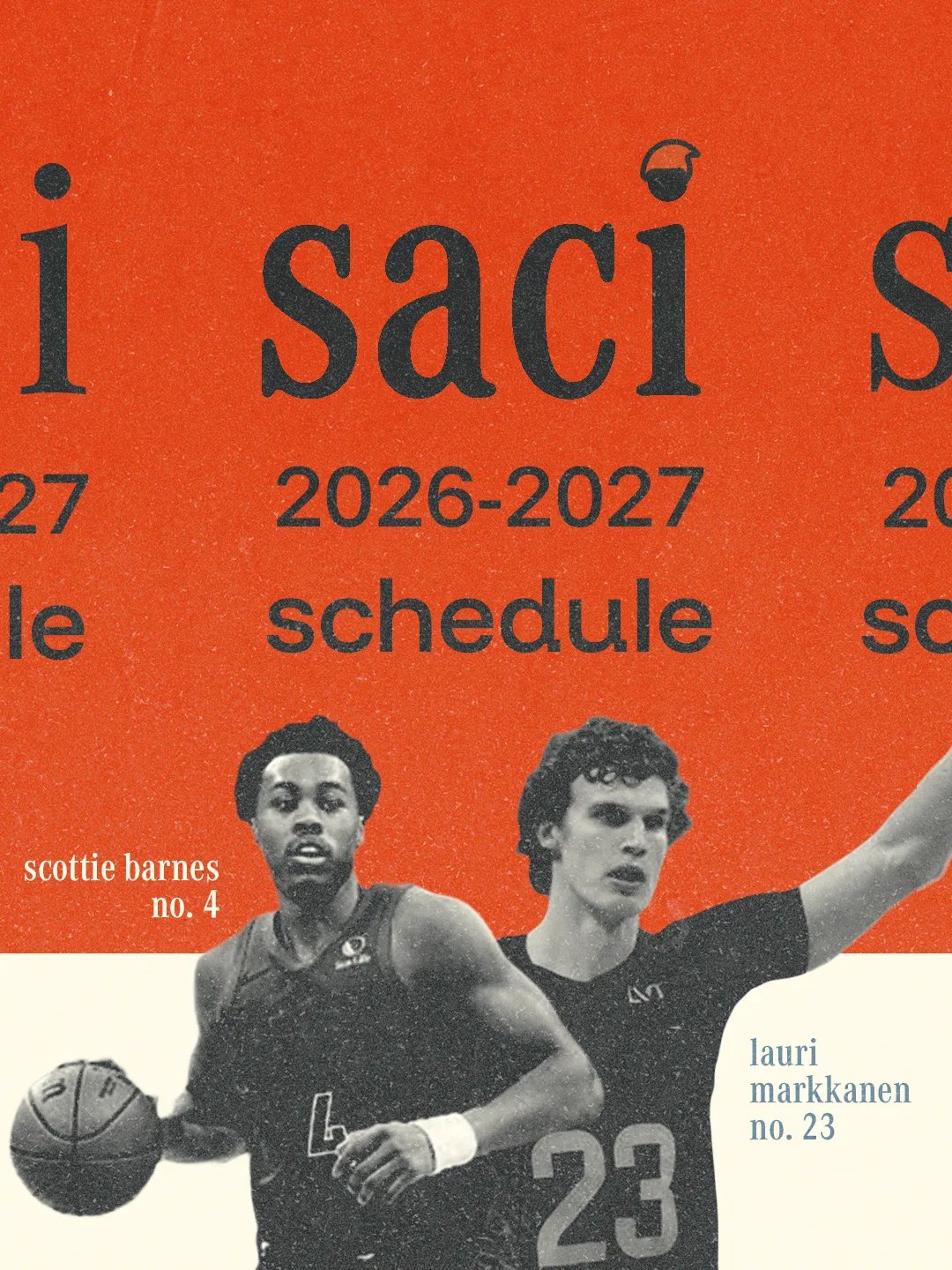
An Instagram carousel. Each slide pairs a player with the opponents and their dates.
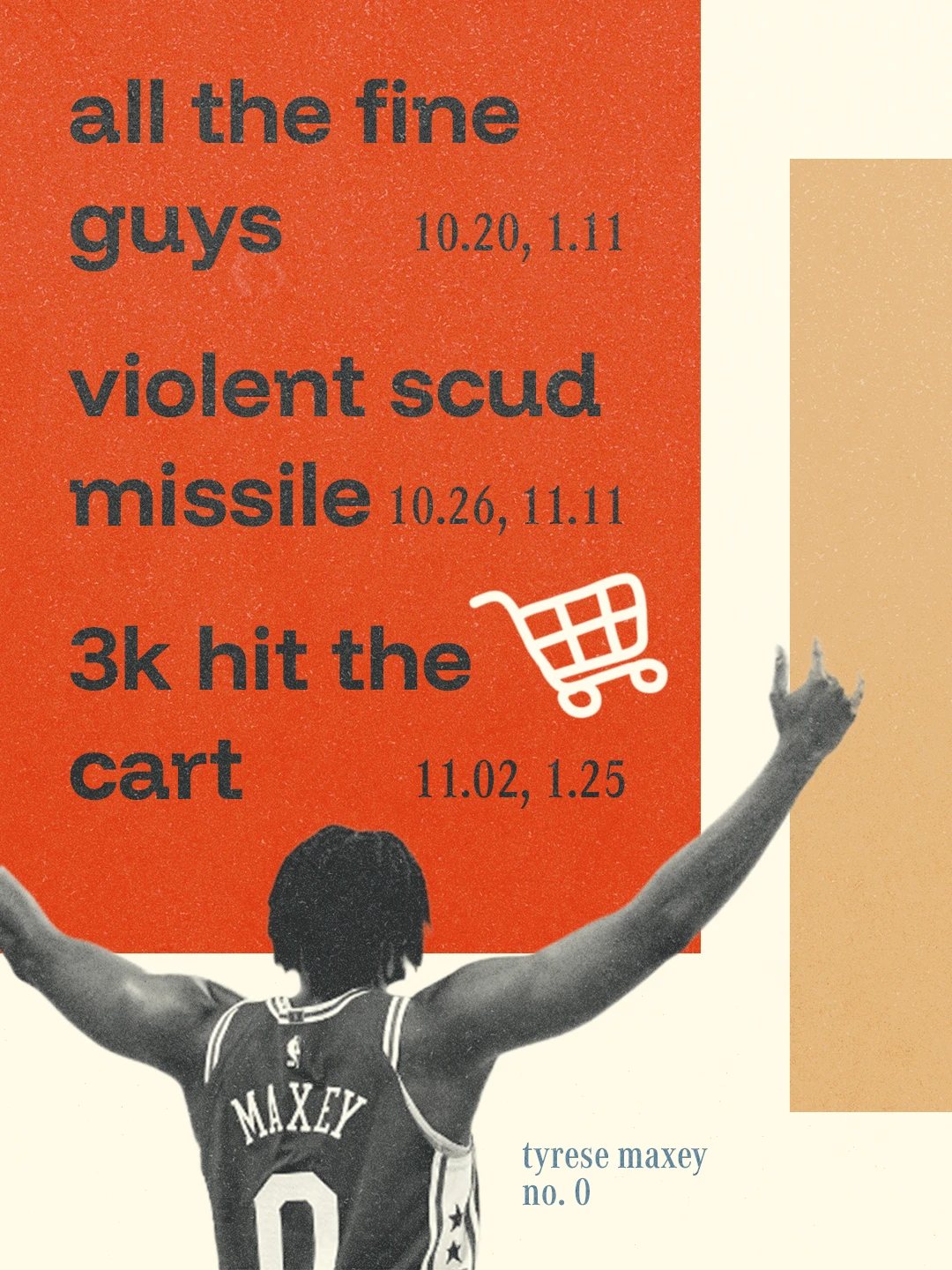
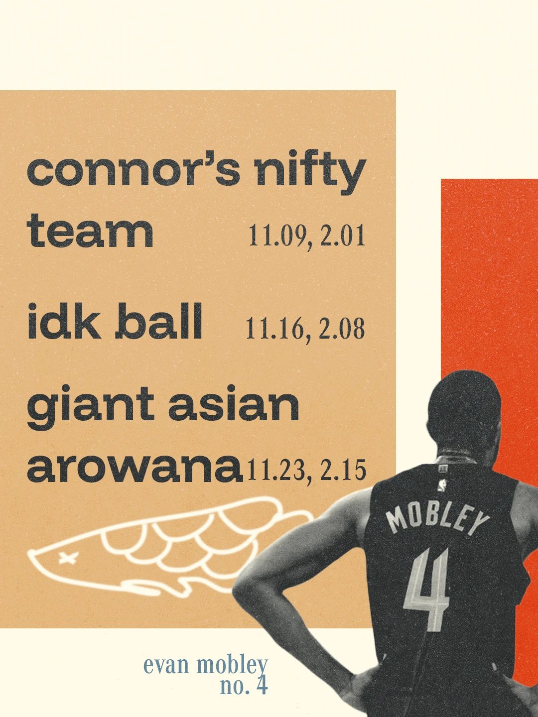
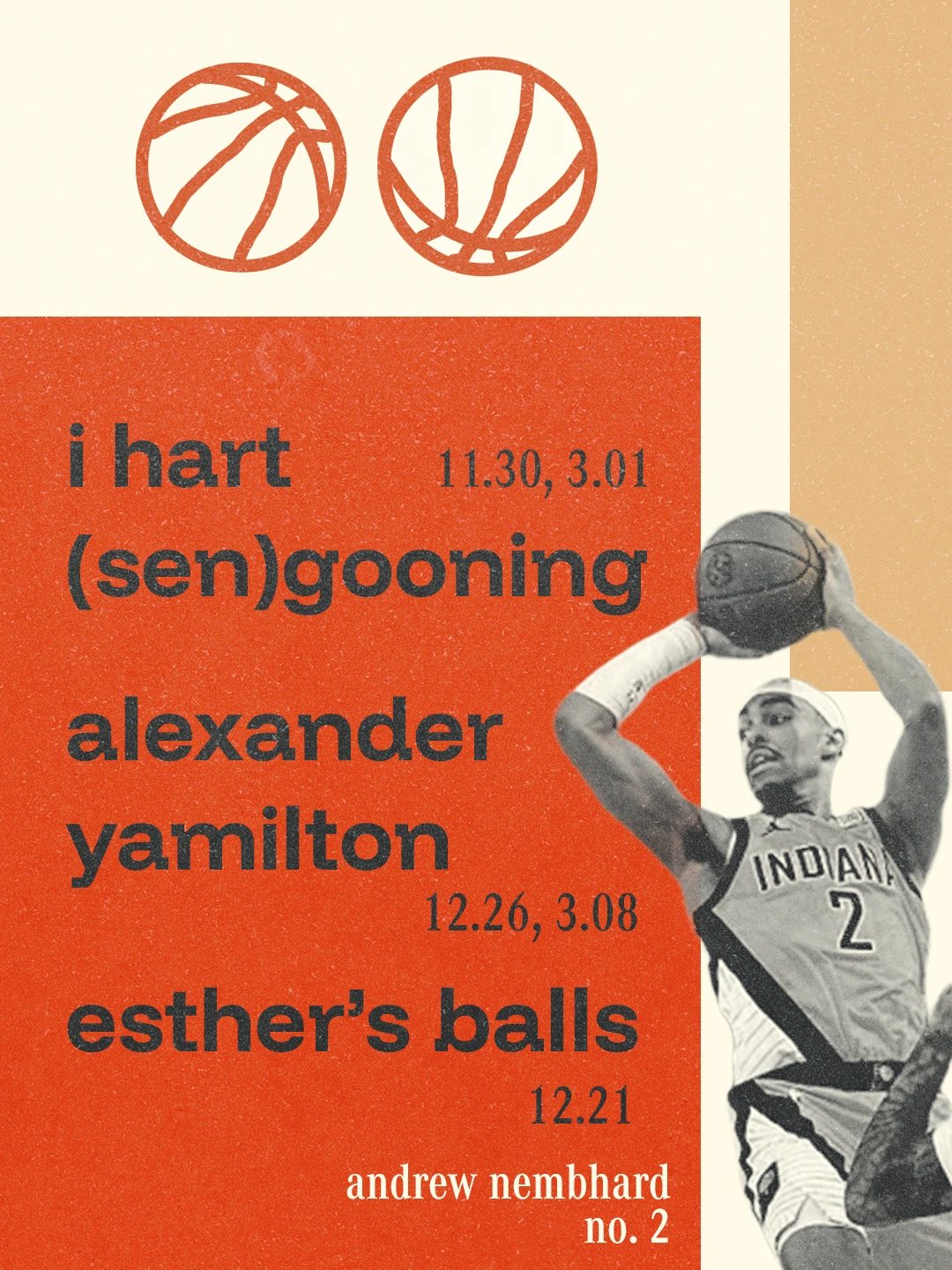
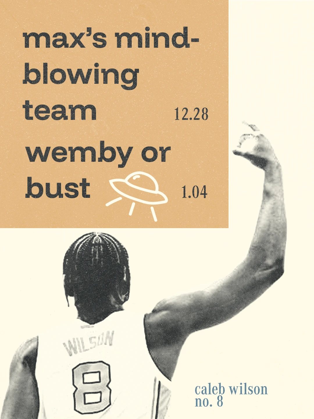
Every week
A player of the week, then the final score, win or lose.
-
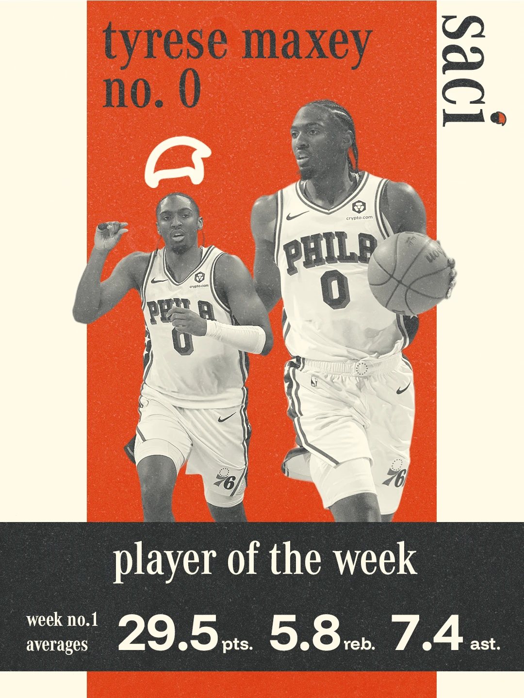
Player of the week -
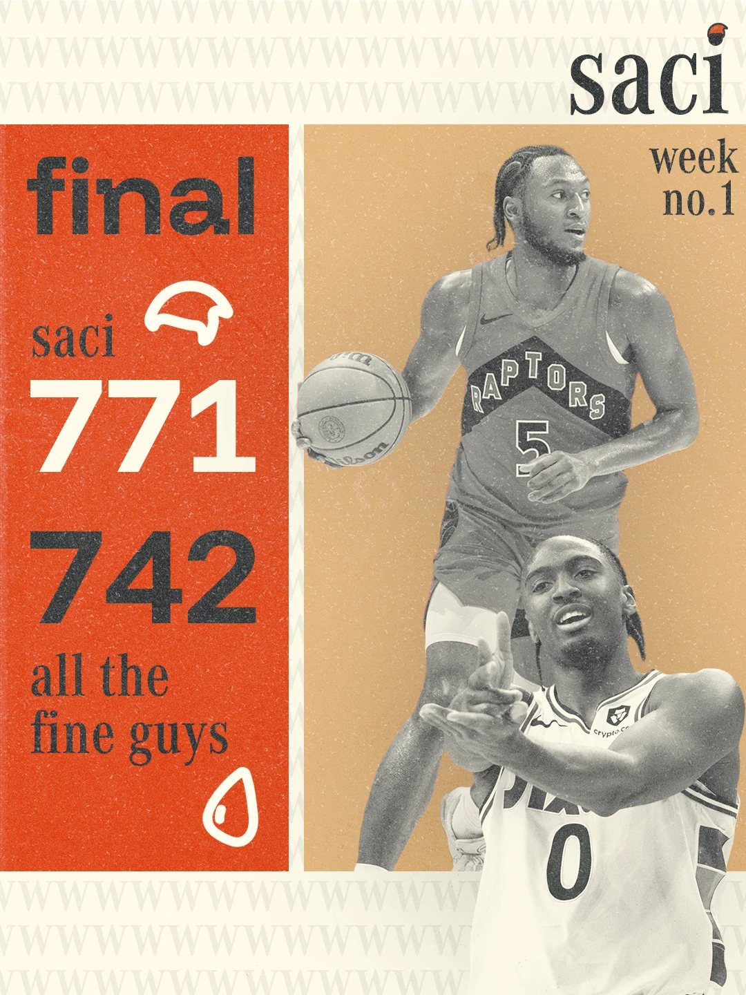
Final — week 1, a win -
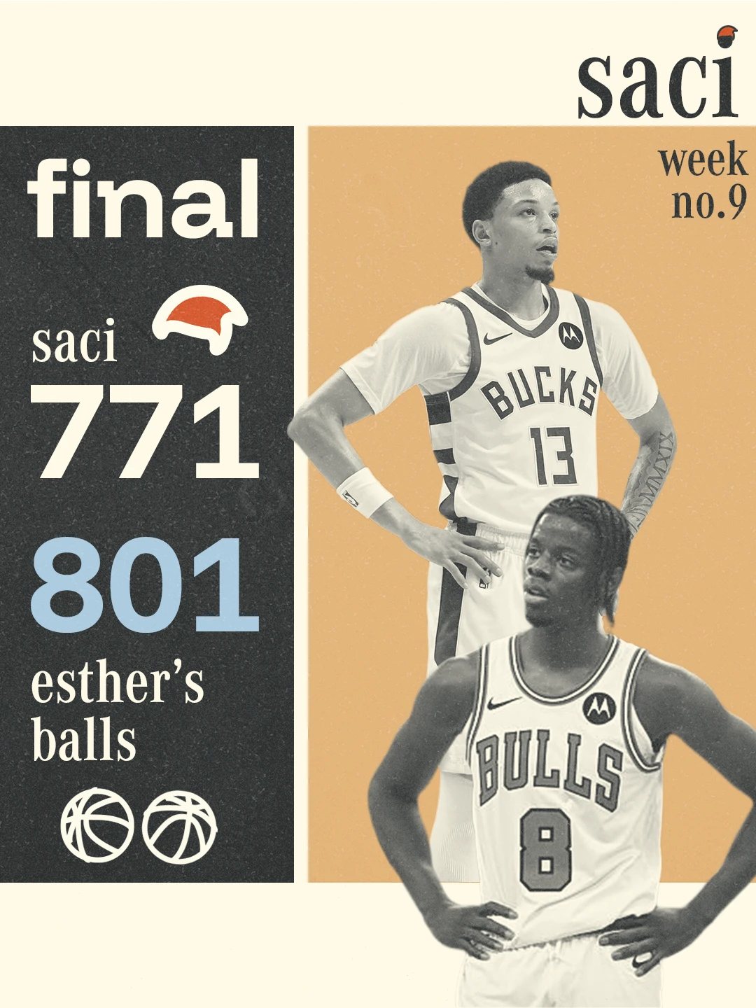
Final — week 9, a loss