Communications design
Salt Lake City Council
Flyers, reports, social and event materials for the Salt Lake City Council and its districts. The brand isn't mine: the City sets it, and I design inside it. Includes a 2025 PRSA Golden Spike Award–winning reel.
Reels
Short videos for Council social. The first one won a 2025 PRSA Golden Spike Award.
-
2025 PRSA Golden Spike Award winner
Council reel — 2025 PRSA Golden Spike Award winner -
Council PSA
The City's rules
I didn't make Salt Lake City's brand. The City's design team sets the standards for the logo, colours, fonts, icons and templates, and every department follows them, Council included. These are the ones that shape every piece.
-
Logo
The Sego Lily is the City's logo. On Council work it's paired with the district's name as a sub-brand, the same lockup every time. The City's more formal Corporate Mark is kept for letters, ordinances and legal documents, so it stays off social.
-

Colour
The City palette has four primary colours, eight secondary and four neutrals. I pick from it and check the contrast, so the text stays readable at feed size and on a flyer.
-
Type
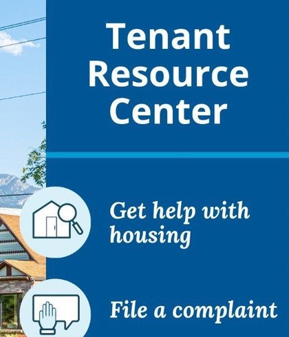
The City's fonts are Open Sans and Lora. On these pieces Open Sans carries the headline and Lora italic carries the supporting lines. When a tool doesn't have them, the fallbacks are Roboto and Georgia.
-
Icons
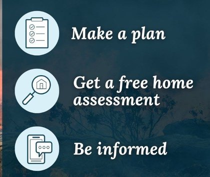
Icons come from the City's own set, not a stock library, so a Council post and a department post look like they come from the same city.


The work
The brand gives me the parts. Picking the photo, building the layout and deciding what gets read first is the job.
-
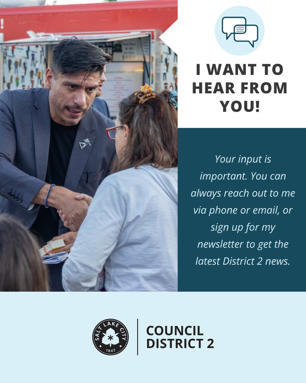
District 2 — I want to hear from you -
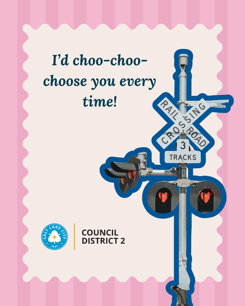
District 2 — choo-choo-choose you -
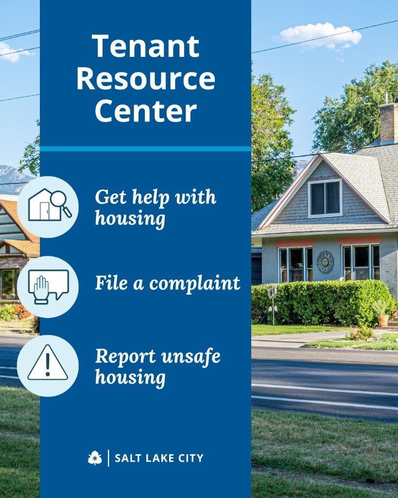
Tenant Resource Center -
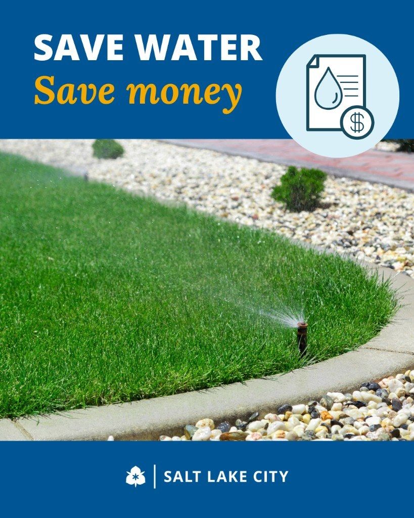
Save Water, Save Money -
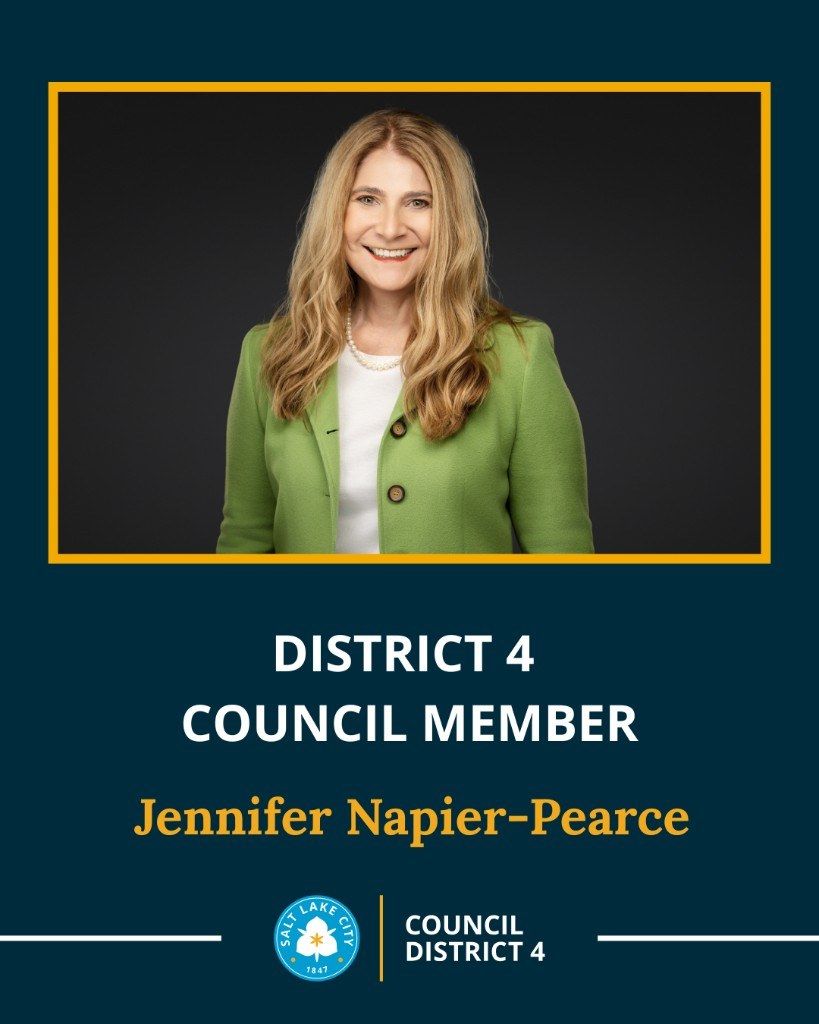
Meet Council Member Jennifer Napier-Pearce -
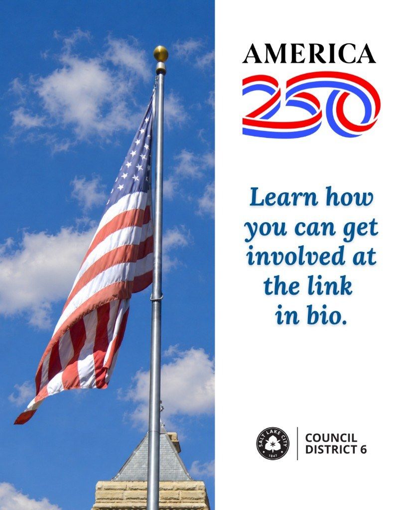
America 250 — District 6 -
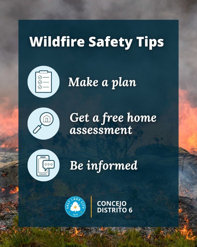
Wildfire Safety Tips — District 6 -
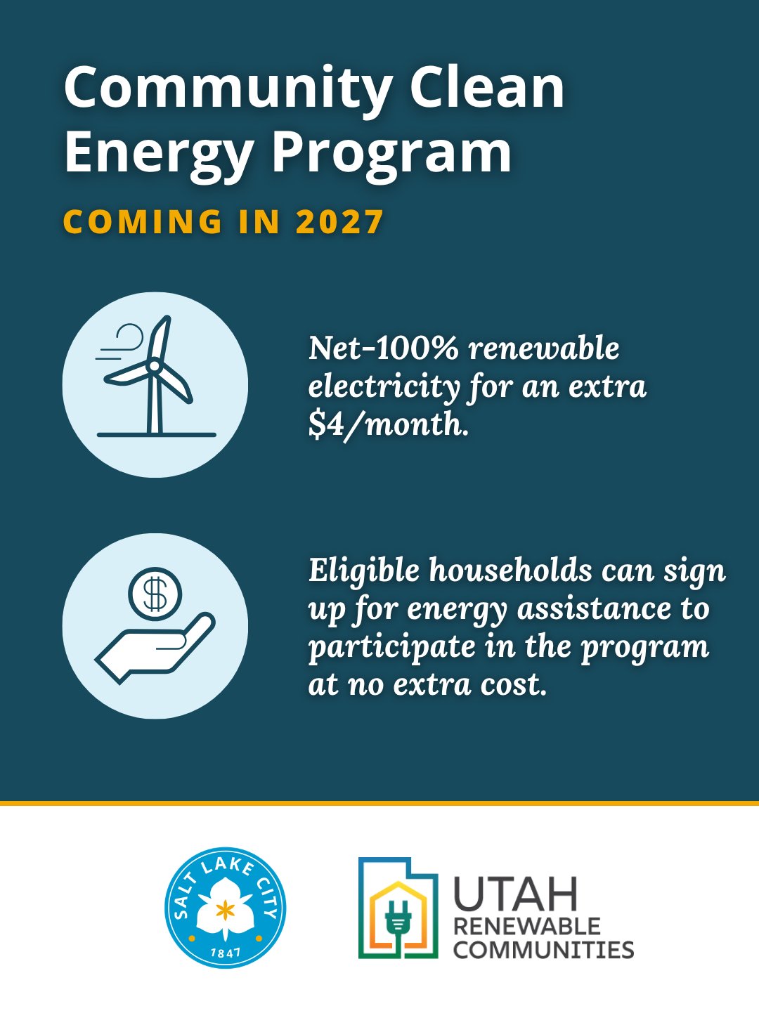
Community Clean Energy Program